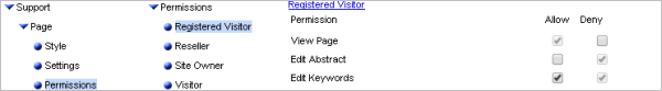
Behavior Editor - HelpEach component has its own Behavior Editor, which allows you to control how it looks and works.In the left pane you can expand the tree by clicking on the arrows. The controls are split into three sections:
ControlsEach control consists of three parts:
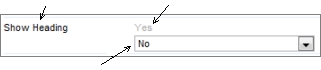
Prompt Inherited value The value to be used is shown in black, so the inherited value changes from black to gray if it is being overridden locally.* Permissions
Permissions can be either Unset, Inherited or Applied. An unset permission is blank. An inherited value is grey. An applied value is black. If you look at the above image you can see all three states. If you apply a value, the 'black' applied value is used - note the Inherited value is not removed from the display - because there will be situations where it is useful to know what the inherited value was. InheritanceThe ability for a control to use inherited values allows you to centrally manage the site, keeping multiple components consistent without having to set the values individually for each one. Whenever the inherited value is changed, all child controls set to use the inherited value are updated immediately. To saveTo save changes, click 'Save changes', close the dialog, and refresh the page.
* Colors mentioned refer to default themeing, and may differ in your site. |
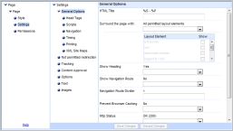 Within each of these sections, the controls are split into several screens. You choose the screen using the middle pane.